Safari vs. Chrome. Main Comparative Differences in UI/UX
Article in Ukrainian here / Стаття українською мовою тут (Copy+Paste) - https://tseux.medium.com/safari-та-chrome-основні-порівняльні-відмінності-в-ui-ux-дизайні-1515f4d418b9
For UI/UX designers, understanding how different browsers handle the safe area for displaying web content is crucial. The safe area is the portion of the screen where content is visible and accessible to users without being obstructed by system UI elements, such as the address bar, tab bar, or navigation controls. Different browsers, such as Safari and Chrome, handle these elements in distinct ways, which can significantly affect the user experience (UX) across macOS, iOS, Windows, and Android. In this article, we’ll explore how the UI/UX design of Safari and Chrome influences the size of the safe area and how designers can account for these differences in their designs.
Desktop: The Impact of Multiple Bars on the Safe Area
Address Bar and Tab Bar Visibility
Chrome: On macOS and Windows, Chrome always displays two bars at the top of the screen: the address bar and the tab bar. This means that the safe area is reduced from the top by these two UI elements. Chrome does not adjust or shrink these bars, which could impact the available screen space for web content.

Safari: Safari on macOS works a bit differently. The number of top bars can vary depending on the number of open tabs. When you have one tab open, Safari only shows the address bar, leaving more space for web content. However, as you open multiple tabs, a tab bar appears underneath the address bar. This variability means that the available safe area in Safari can change dynamically based on the user's tab management.

Additionally, for both Safari and Chrome, there is the possibility of adding a third bar — the Favorites Bar. The Favorites Bar allows users to store and quickly access their favorite websites, either through icons (favicons) or text. This feature is enabled by default in Chrome but can be turned on or off in Safari through preferences. The Favorites Bar further reduces the available safe area, as it adds an additional layer of UI elements beneath the address and tab bars.


Chrome on macOS vs. Windows
While Chrome on macOS and Windows share the same basic layout, there is an important difference to consider regarding the taskbar:
- Chrome on macOS is typically not obstructed by a taskbar, as macOS uses a menu bar at the top of the screen, and the application windows do not take up screen space in the same way as Windows does.
- On Windows, Chrome is affected by the taskbar at the bottom of the screen, which takes up space and reduces the available safe area. When using Chrome on Windows, the taskbar can obscure part of the browser window, which means there is slightly less space for content on the screen. This is particularly important for web designs that rely on full-page layouts, as the taskbar will always reduce the usable area of the browser.

Considerations for UI/UX Designers:
When designing for Chrome, keep in mind that the safe area will always be affected by two bars at the top, which may take up a significant portion of the screen.
In Safari, the safe area can change depending on the number of tabs open. If the design relies on more screen space at the top, it’s essential to account for this variability and test across different states (one tab vs. multiple tabs).
When the Favorites Bar is enabled, both browsers reduce the safe area by occupying additional space at the top of the screen. This is important for designers to consider when designing for users who frequently use bookmarks or favorites, as it will impact the available space for the content of the page.
Furthermore, on Windows, the presence of the taskbar requires designers to account for additional space at the bottom of the screen. In full-screen or maximized modes, the taskbar might still remain visible, further impacting the safe area.
Tablet: Flexible Layouts and Navigation
Address Bar Positioning on iPad (Safari and Chrome)
Safari: Safari on iPad offers more flexibility in terms of positioning the address bar with navigation controls: users (not on every device model) can choose whether it appears at the top or bottom of the screen. However, this feature is more prominent in newer iOS versions and may not be available in all configurations. The address bar can move to the bottom, freeing up space at the top, which is useful for larger screen sizes.
Chrome: Chrome on iPad only allows the address bar to be positioned at the top of the screen, meaning the safe area will always be reduced by the height of the address bar and tab bar.

Tab Bar Behavior
Safari:
- In portrait mode on iPad, Safari does not display the tab bar when only one tab is open. The only visible UI element at the top is the address bar. This means that more space is available for web content. If multiple tabs are open, Safari will display the tab bar, but it will only appear when needed.
- In landscape orientation on iPad, the number of bars can vary depending on the number of open tabs. If only one tab is open, the safe area will be larger as only the address bar is visible. When multiple tabs are open, a tab bar will appear, reducing the available safe area.

Chrome:
- In Chrome on iPad, the tab bar is always visible in portrait mode, regardless of the number of tabs open. The address bar and tab bar are both fixed at the top of the screen, which may reduce the available space for the content.
- In landscape mode, Chrome on iPad consistently displays two bars (address bar and tab bar), so the safe area will always be slightly reduced in landscape view, regardless of the number of tabs.

Considerations for UI/UX Designers:
Designers must be aware that Safari on iPad provides flexibility in address bar positioning, which can impact the safe area. The ability to move the address bar to the bottom can provide more screen space at the top, but it requires testing to ensure the layout works across different screen configurations.
Chrome on iPad and Safari in landscape mode may reduce the safe area with the tab bar, especially when multiple tabs are open.
Mobile: The Dynamic Safe Area Based on Orientation and Tabs
Address Bar Positioning on iPhone (Safari and Chrome)

Tab Bar Behavior
Safari:
- The same as for iPad - in portrait mode Safari does not display the tab bar when only one tab is open. The only visible UI element at the top is the address bar. This means that more space is available for web content. If multiple tabs are open, Safari will display the tab bar, but it will only appear when needed.
- In landscape orientation on iPhone, the number of bars can vary depending on the number of open tabs. If only one tab is open, the safe area will be larger as only the address bar is visible. When multiple tabs are open, a tab bar will appear, reducing the available safe area.

Chrome:
Chrome on mobile (both iOS and Android) does not show tabs in a traditional tab bar when in landscape mode. Instead, it maintains a compact UI with the address bar and navigation buttons. To switch between tabs, users need to access the tab switcher, usually by tapping the tab icon.

Dynamic Viewport
In Safari and Chrome, the viewport size changes depending on whether the user is at the top of the page or has scrolled down.
- When scrolled: The address bar slightly collapses, and the tab bar hides, expanding the interactive area.
- At the top of the page: The area under the bottom bars remains visible but is blurred and not directly accessible. While users don’t see it clearly, it influences bar colors and interaction.

Considerations for UI/UX Designers:
If your design relies on the scrolled view, some elements may be hidden when at the top, and vice versa. To ensure important elements (e.g., buttons) remain accessible, consider making them fixed to the bottom rather than scrolling with the content.
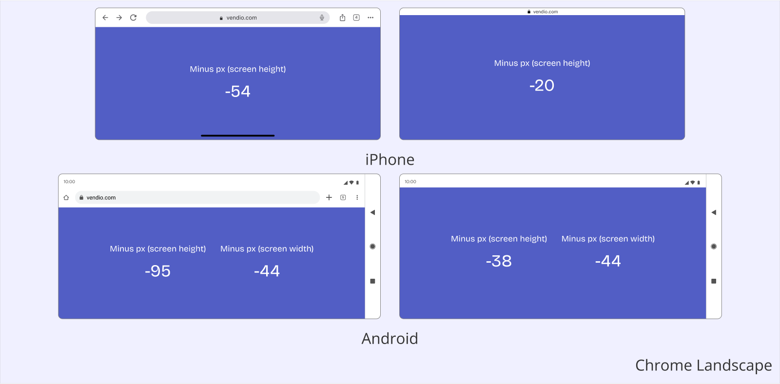
Chrome on iPhone vs Android
Although Chrome is a single product, certain elements, such as colors and typography, adapt to the native design of each platform. The key differences lie in the navigation bar and other UI components. However, the most notable distinction appears in landscape mode—on Android, the navigation bar shifts to the right side while maintaining the full screen width, whereas on iPhone, the layout behaves differently.

Conclusion:
Understanding the UI/UX differences between Safari and Chrome across macOS, iOS, Windows, and Android is essential for designers to create consistent and accessible web experiences. Each browser handles safe areas, navigation bars, and tab bars differently, impacting how content is displayed.
- Desktop: Chrome consistently displays both the address and tab bars, while Safari’s layout changes based on the number of tabs. On Windows, the taskbar further reduces the safe area.
- Tablet: Safari on iPad offers more flexibility with address bar positioning, while Chrome maintains a fixed layout. The safe area can change dynamically in Safari, requiring careful UI adjustments.
- Mobile: Both browsers allow users to move the address bar, but dynamic viewport changes affect content visibility, especially when scrolling. Chrome and Safari differ in how they display tabs, particularly in landscape mode.
For UI/UX designers, accounting for these differences is crucial when designing layouts, positioning interactive elements, and ensuring accessibility across devices. Testing across multiple configurations helps maintain a seamless user experience regardless of the platform or browser.


